The MLB season is finally set to start sometime in the next month. Though shortened, 2020 will still count like any other year. This is the first time in a long time that with 60 games left, the Mariners are tied for or in first place!
Sorry—I had to say it. Yes, the season will be only 60 games, total but if Kyle Lewis can hit 20 home runs in that span, it would be the equivalent of hitting 50 home runs in a regular season.
Just keep that in mind!
As a fun way to get our gears thinking about the Mariners, I wanted to go through some of their best and worst uniform choices over the years.
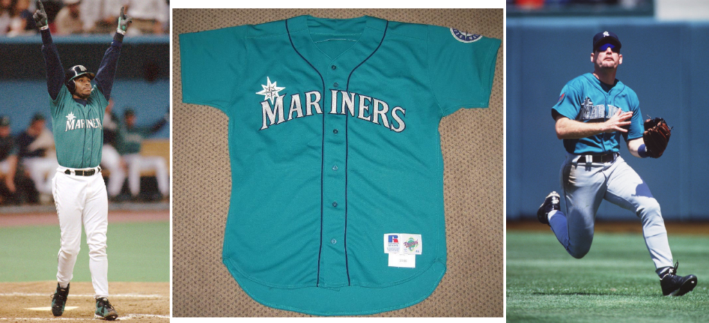
The Good: Mariner Teal (1994-1996 & 2011 – Present)

Now, these aren’t the only good jerseys the Mariners have had over the years. But you have to ask yourself, “Which jersey did John Olerud look best in?” Then it becomes fairly simple.
These jerseys are quintessential Mariners. In 2010, the M’s wore their 1994-96 teal jerseys in a throwback game, and the reaction was so positive the team decided to return the look for 2011. Beyond the trendiness in the mid-90s, teal has become a signature of the current team and would have to be the most recognizable for the Mariners in the MLB. It harkened back to their younger years in the ‘70s and ‘80s when a touch of baby blue set them apart. I consider this uniform an all encompassing feel of the Mariners through the years.
They got this one right.
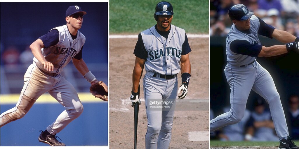
The Bad: Mariner Vests (1997 – 1999)

Vests as jerseys was a real-deal ‘90s maneuver by the Mariners. They were not the only team to do sleeveless uniforms, but regarding the Mariners, it never really did anything for me.
Both home and road uniforms were identical and just flipped the color scheme of white, grey and sometimes alternate with a navy blue. The gray and the white vests were worn with a navy undershirt.
Two jerseys, one undershirt.
The club sometimes paired these with a solid blue cap. The multiple layers looked uncomfortable. It gave off the effect that it wasn’t an entire jersey at all.
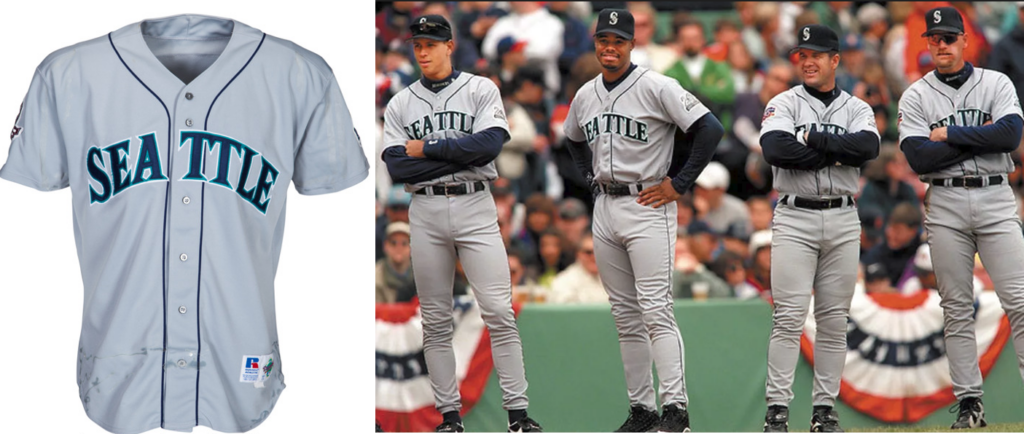
The Ugly: Grey Jersey Grey Pants Road Uniforms (1993 – Present)

Over the years this look for the Mariners has been given minor tweaks, whether the inseam got a blue touch-up or the word SEATTLE switched to MARINERS. I don’t care how you dice it—these uniforms only reflect the weather that dominates the Pacific Northwest, with a hint of doom and gloom. I wish a vitamin D pill could brighten these uniforms up, but alas, they just blend in so well!
We have seen a lot of trials and tribulations, wins and losses, ups and downs in these uniforms, so historically speaking, they have a lot to say. But it feels like a cop-out for the Mariners who have such a vibrant and fun fan base. Look at the Sounders, the Timbers, the Trail Blazers, the Seahawks, the Oregon Ducks—I mean the list of flare goes on and on.
Nothing is as boring as these jerseys! With that being said, in the first half of the 20th century, the players rarely got multiple uniform options, and while at home, the jerseys got washed every day. While on the road, not so much, and the dirt would show more prominently day over day.
As locker room care and baseball teams grew, nearly every MLB team got a grey jersey! Grey allowed for a less-noticeable level of dirt than white while on the road. So traditionally speaking, they hit the nail on the head. The Mariners, however, never stopped to think that the grey uniforms themselves, are in fact, the dirt.
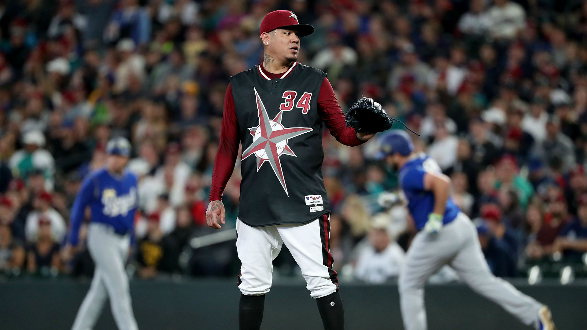
The Love/Hate Relationship: Turn Ahead the Clock Night ( Debuted in 1998)

As a promotional night, Lou Piniella and the Gang added some pizzazz to their routine by attempting to see into the future of what uniforms would be like in an alternate, sci-fi reality. I love it. They had entered the Biodome of 2027 and throughout the entire rule book. The red and black have nothing to do with the Mariners!
These are just untamed and possibly the most ‘90s uniforms in the history of baseball, so I have to love and hate them at the same time. If you’re a Mariners fan, you might feel the same way! Sure the huge logo is gaudy and brutish, but I still think these look pretty cool, even if I don’t really know why. These uniforms are much like a Sacha Baron Cohen movie—possibly avoidable, hard to watch for more than 90 minutes, yet tons of fun.


I didn’t even know they had a space age uniform! Yes not flattering.