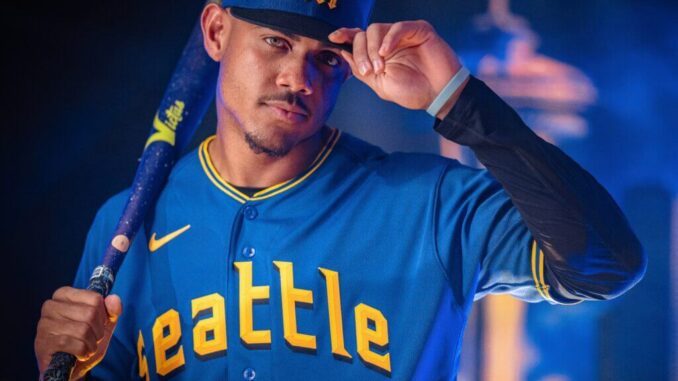
The Seattle Mariners just unveiled their brand-new Nike City Connect uniforms, and they are something else! These new units capture Seattle’s innovative spirit and pay homage to its rich baseball history. The Mariners will wear these new uniforms for every Friday home game for the next three years. Let’s review the new jersey and some of my favorite jerseys from the past.
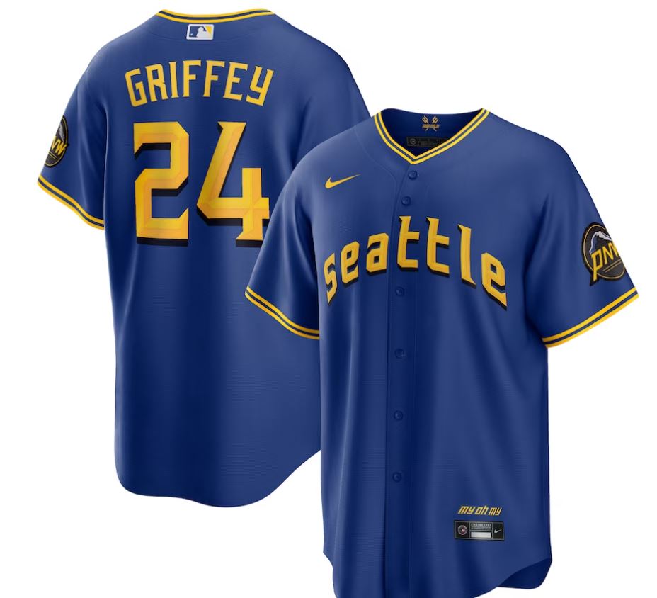
The new uniforms feature Amarillo, Rush Blue, and Sundown shades, also part of the Mariners’ original color scheme. But that’s not all – these hues also pay tribute to the Pilots, Seattle’s first Major League Baseball team that played for just one season in 1969 before becoming the Brewers. Look closely at the jersey, and you’ll notice the word “Seattle” stitched across the chest in a lettering style that resembles the Pilots’. Likewise, theIn addition, the black drop shadow gives a shout-out to the 1955 Pacific Coast League champion Rainiers. And the black accents on the pants? They honor the Seattle Steelheads, whose uniforms in the 1940s featured black as a primary color.
But that’s not all—the patch on the jersey sleeve features Mount Rainer, representing the Pacific Coast League’s Seattle Rainiers. And “PNW” is stamped in sundown gold to pay homage to the region’s great outdoors. Plus, you’ll find some fantastic leaf embellishments on the edge of the patch, inspired by the Pilots’ caps, which honor the maritime and aviation industries of the region.
The phrase “My Oh My” is another fantastic addition, found on the bottom front of the jersey above the jock tag, in honor of Hall of Fame broadcaster Dave Niehaus’ famous phrase. And, within the stitching of the jersey collar, you’ll find the phrase “Sodo Mojo,” celebrating the neighborhood that the Mariners have always called home. The collar even has two tridents pointing skyward to form the letter “W,” representing the state of Washington and the team’s pursuit of victories.
The cap is beautiful, with a modernized Mariners trident, a royal blue crown, and a black visor. But, and here’s the kicker, it’s the first time this color combination has been used for an on-field cap in Seattle baseball history!
Now that we’ve covered the new jerseys, let’s look at my favorites of all time.
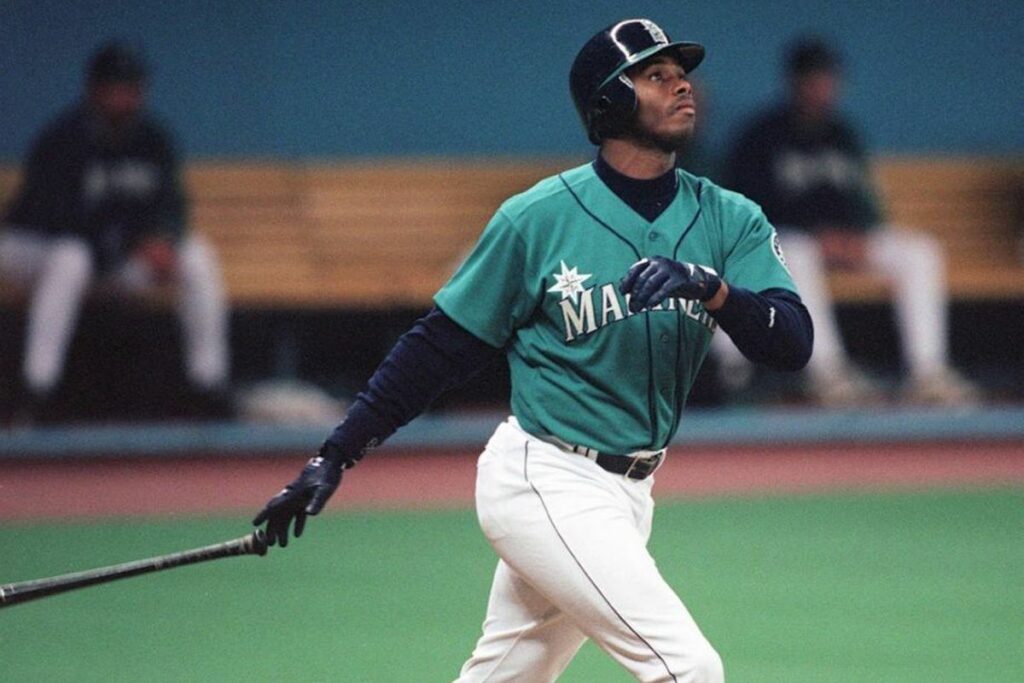
1995 Alternate – For me, the teal always stuck out. There were a couple of options for this, some newer, but you must return to the 1995 jersey, as it signifies their first success in the league. 1995 was the first year the Mariners made the playoffs, getting to the ALCS before losing to the Cleveland Indians. You can also say that this is the most memorable Ken Griffey Jr jersey.
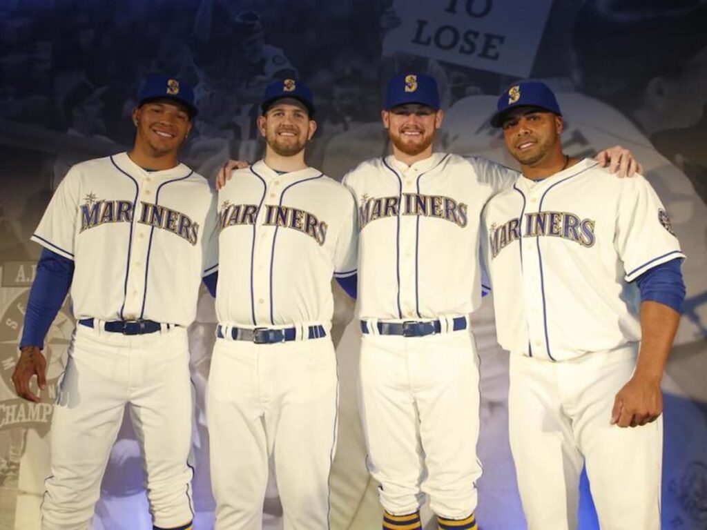
2015-Current Sunday Homes – The jersey and pants have a timeless cream hue, while the lettering and logo have been revamped to feature the original Mariners colors. Check out the “Mariners” lettering – it’s got royal blue coloring with a gold trim outlined in royal. In a nod to the good old days of baseball uniforms, the players’ names won’t be on the back – instead, you’ll see large block numbers in royal with gold trim. And, of course, every uniform is complete with a cap and socks! The royal-blue cap sports a gold Mariners “S” and compass rose baseball logo, while the socks are royal blue with gold stripes.
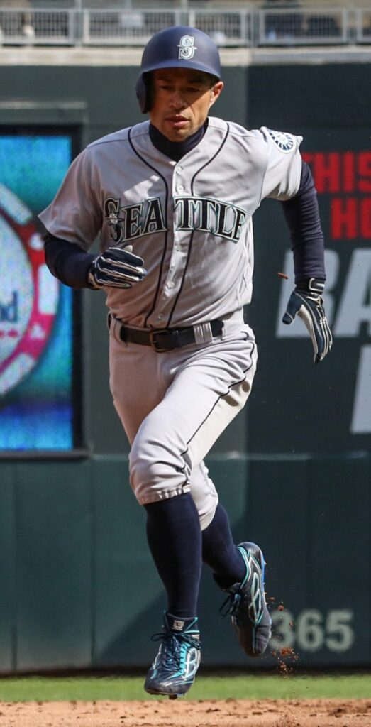
2001-2014 Seattle Homes – When I think of the Seattle Mariners, this jersey is the one that is etched in my brain. The only change from the 2000 jersey to this one was the change of the “S” to match their hats, rather than have a plain “S.” 2001 was also that famous year that the Mariners won 116 games, tying the Major League record, held by the 1906 Chicago Cubs. Of course, most fans will also remember Ichiro Suzuki, who captivated the league with his MVP, Rookie of the Year, Gold Glove, and Silver Slugger season.
