While they’ve only been a member of the Western Hockey League since the late 1970s, the Portland Winterhawks own a reputation as one of the most successful franchises in the Canadian Hockey League. The Winterhawks have played in a dozen WHL final series for the Ed Chynoweth Cup, winning three times. Online betting sites such as Bovada Sports always list the Winterhawks among the contenders for the WHL championship.
Between 2010-11 and 2013-14, Portland played in four successive WHL finals, winning a six-game series from the Edmonton Oiler Kings for the 2012-13 league title. In 1982, the Winterhawks became the first American-based team to play for the Memorial Cup. The following season, Portland played host to the Memorial Cup, the first time it had been held in a U.S. city and put a cherry on top of the event by becoming the first U.S.-based club to win the major junior hockey championship.
“Portland Winterhawks” by Keith Dwiggins is licensed under CC BY 3.0
In 44 years as a franchise, the team has sent 143 players to the NHL.
Lately, though, the Winterhawks have been gaining a reputation for what’s on the front of their jerseys as much as for what the team accomplishes on the ice. The club’s logo of the head of a Native American man served as a hot button issue for several years, with several Native groups calling for its removal and a Change.org petition being organized demanding that the Winterhawks and all sports franchises using Native American logos eliminate them.
According to the American Psychological Association, “the continued use of American Indian mascots, symbols, and images have not only negatively impacted American Indian youth by harming their self-esteem and social identity development, but can also have detrimental effects on the education of all community members by perpetuating one-sided stereotypes.”
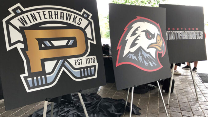
Last season, the NFL’s Washington Redskins eliminated their offensive logo and team nickname, going with the Washington Football Team as the club’s new name. The Cleveland Indians also announced plans to change the team’s nickname and logo following the current MLB season. Now the Winterhawks are following suit. The announced the elimination of its Native American logo and the introduction of a new logo that will be used going forward.
A Bargain Led To Offensive Logo
In 1976, Edmonton’s WHL franchise was relocated to Portland. The team needed uniforms. It just so happened that the NHL’s Chicago Blackhawks had a set of their old jerseys up for sale. A deal was struck, Portland’s team became the Winterhawks and the Blackhawks Illinois Sauk Nation figure logo became Portland’s logo.
There was no reason for it, no connection to the Portland area behind the move. It was simply a bargain that saved the team a few bucks and gave the club a logo that would eventually grow to be offensive to so many.
“Portland Winterhawks, Nick CIcek” by Matthew Wolfe/Portland Winterhawks is licensed under CC BY 3.0
Time For Change
Winterhawks majority owner Michael Kramer put his reasoning behind the long-overdue change in logo into simple terms. “We deserve our own identity,” Kramer told Oregon Live. “We need something that belongs to Portland.”
Kramer heads a group that purchased the franchise in January of 2021.
The club’s new primary logo is a right-facing hawk featured with a predominantly white head. It also carries the tradition of the team’s former colors of black and red. The new scheme adds celly gold and also squall gray, a color distinct to the new Winterhawks brand.
Also featured on the bird’s head are two feathers, carrying the legacy of the franchise’s roots and serving as a subtle nod to the feathers in the previous logo. The bottom of the hawk’s head includes Mount Hood in the aforementioned new squall gray, an iconic mountain from the Cascade Range synonymous with the Portland area. Located within the Mount Hood figure are also the letters “W” and “H”, for further characterization of Winterhawks.
The new brand identity was created in collaboration with Portland Gear, a local Portland-based company and designed by Brian Gundell, a University of Oregon graduate who has created work for NHL, MLB, NFL, MLS, MiLB, Adidas and Under Armour.
“The Portland Winterhawks are embarking on a new chapter in franchise history, so it is only fitting they do so with a new primary logo design that truly represents Portland, the Pacific Northwest and its great fanbase,” WHL Commissioner Ron Robison said.


